| All Rights Reserved
This global educational platform is designed to support digital learning for primary and secondary school students. It provides a wide range of tools for interactive learning, assignment management, and progress tracking, serving students, teachers, and school administrators alike.
The platform is used across multiple countries and languages, and includes features such as book viewers, dashboards, grading tools, and classroom gamification systems. Our team was tasked with improving usability, engagement, and consistency — transforming the platform into a more intuitive, scalable, and learner-focused experience.
The platform, used by students, teachers, and administrators across multiple regions, was facing mounting usability issues. The interface lacked consistency and adaptability for different age groups and user types. Students, particularly younger ones, found the experience unintuitive and dull, while teachers and admins were overwhelmed by fragmented tools, unclear flows, and scattered feedback mechanisms.
As the platform scaled globally, user engagement and task completion began to suffer. Outdated interaction models, cluttered UIs, and a lack of motivation mechanisms resulted in missed learning opportunities and an increasingly difficult-to-maintain product.
Our team of six designers set out to rethink the platform holistically, starting with research-led discovery across multiple regions, including onboarding with stakeholders in Mexico and Castillo. We conducted deep platform audits and benchmarking against market leaders like Khan Academy and Duolingo Kids to understand what drives both engagement and educational outcomes.
From there, we aligned our work around four pillars: usability, motivation, scalability, and consistency. We mapped out task structures in collaboration with project managers and business analysts, organized Jira workflows, and defined clear design ownership across squads. Every solution was tested through prototypes, user testing sessions, and sprint-based feedback loops.
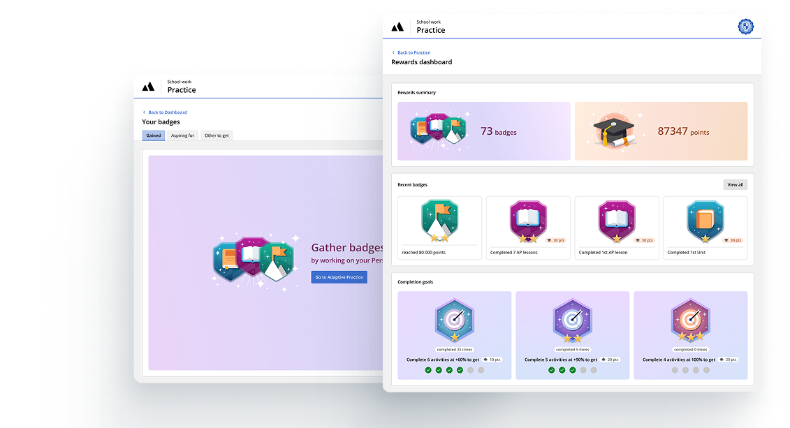
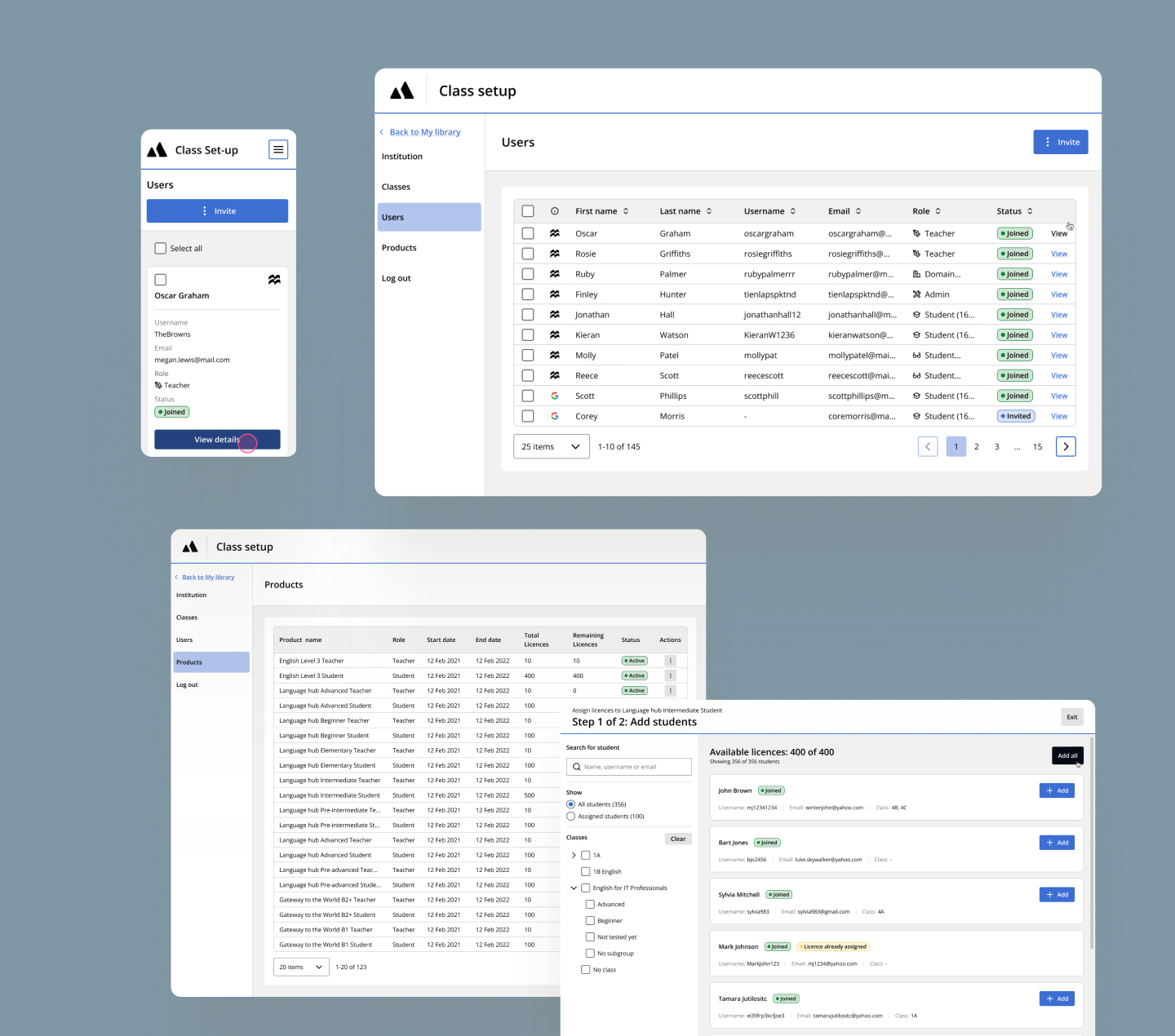
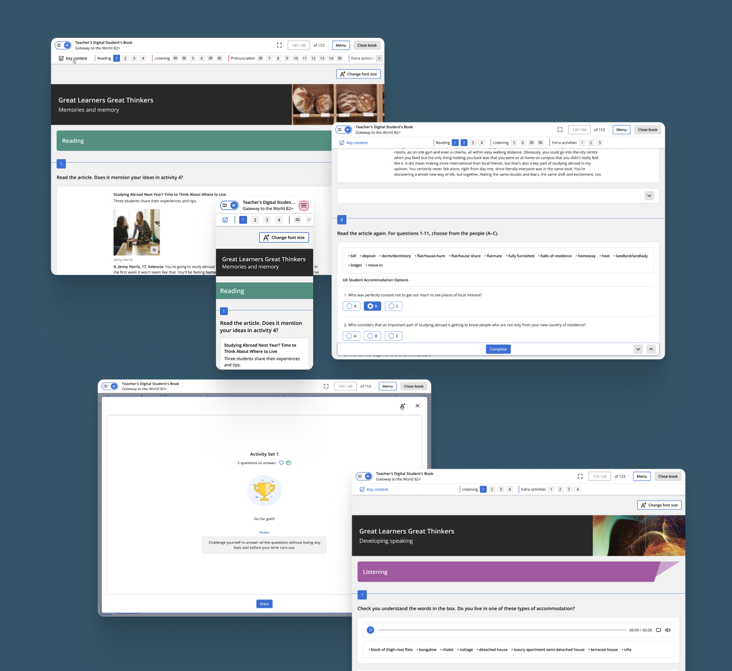
We adopted a child-first lens for student views, while ensuring teachers and admins had streamlined workflows for assigning, grading, and tracking progress — all wrapped in a scalable system architecture.
Over the course of a year, we delivered and iterated on dozens of critical flows and modules:
The platform is now significantly more usable, engaging, and consistent — across every user group. Students enjoy a cleaner interface, playful incentives, and clearer progression. Teachers have faster ways to assign and grade work, and admins benefit from scalable systems and cleaner navigation.
Our gamification work led to increased motivation and daily platform use. Feedback from user testing and internal reviews confirmed major improvements in task completion, satisfaction, and educational engagement. The reading view project made the courses accessible for everyone.
Internally, our structured design system, QA standards, and cross-team alignment set the foundation for continued iteration and expansion. This was not just a redesign — it was a strategic transformation of how learning happens on the platform.
| All Rights Reserved