

Transforming Legacy Healthcare Operations
Petramedica is a prominent network of medical clinics operating across the Warsaw region, providing comprehensive medical care to thousands of individual B2C patients and corporate B2B clients daily. Despite their strong clinical reputation and expanding physical infrastructure, the client's digital ecosystem had severely lagged behind. Their existing web presence functioned merely as a static, outdated informational brochure rather than a functional operational tool, forcing users to rely almost entirely on traditional, offline communication.
This reliance created a massive operational bottleneck. The clinic's administrative and frontline staff were continuously overwhelmed by endless phone calls, manual data entry, and tedious cross-verification across disconnected databases. The core objective of this project was to orchestrate a complete digital transformation—overhauling the passive website into a fully interactive, patient-centric booking platform. By migrating patients from phone lines into a streamlined digital channel, the project aimed to dramatically reduce the administrative workload, eliminate manual scheduling friction, and provide patients with the round-the-clock digital flexibility expected in modern healthcare, ultimately establishing a scalable foundation for future digital patient services.
Transitioned from manual scheduling to a fully scalable self-service platform, moving patients into the digital channel.
Drastically cut down the manual workload and verification time the administration team spent cross-checking databases.
Both the number of patients and booked services increased successfully.
A "Fake" Automation Reality Check
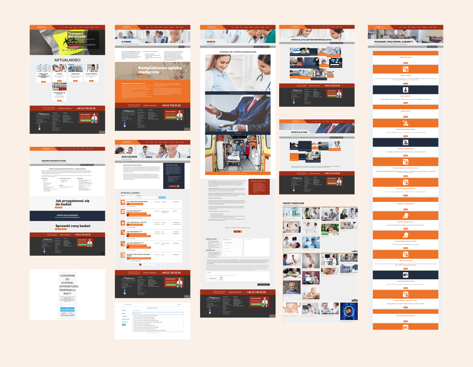
When I first audited the existing digital presence, I had a frustrating "Aha!" moment. The chaotic environment wasn't just bad for users; it was actively hurting the business.
The "Fake" Booking
I was shocked to discover that the old online "booking forms" didn't automate anything. They merely sent emails to the admin staff, who then had to manually verify data across two disconnected databases before confirming the visit.
Information Chaos
The legacy site was a dumping ground for information. B2B services (occupational medicine) were heavily mixed with B2C offerings, causing constant user confusion and misdirected inquiries.
Cognitive Overload
The medical descriptions provided by the client were highly complex, overly academic, and inconsistent.
Getting Scrappy with Qualitative Data
With zero analytics set up on the old platform, I had to get scrappy. I relied heavily on qualitative data and Subject Matter Expert (SME) interviews with the clinic's management and administrative staff.
Mapping the Architecture & Pain Points
Thanks to candid conversations with the staff and mapping the existing architecture, I uncovered the most frequent patient struggles. This qualitative data became the absolute foundation for our new navigation strategy.
The Public vs. Private Divide
I realised early on that services funded by the National Health Fund (Public/NFZ) required entirely different descriptions, legal flows, and contexts than commercial ones. That was also the moment we've uncovered the potential issues of the existing integrations letting the company settle the NFZ visits and costs.
UX Writing as a Strategy
I took on the role of a UX Writer, ruthlessly standardizing and simplifying massive text blocks to ensure high scannability, keeping the deep medical information accessible only upon deeper clicks.
Structuring the "Toggle" Ecosystem
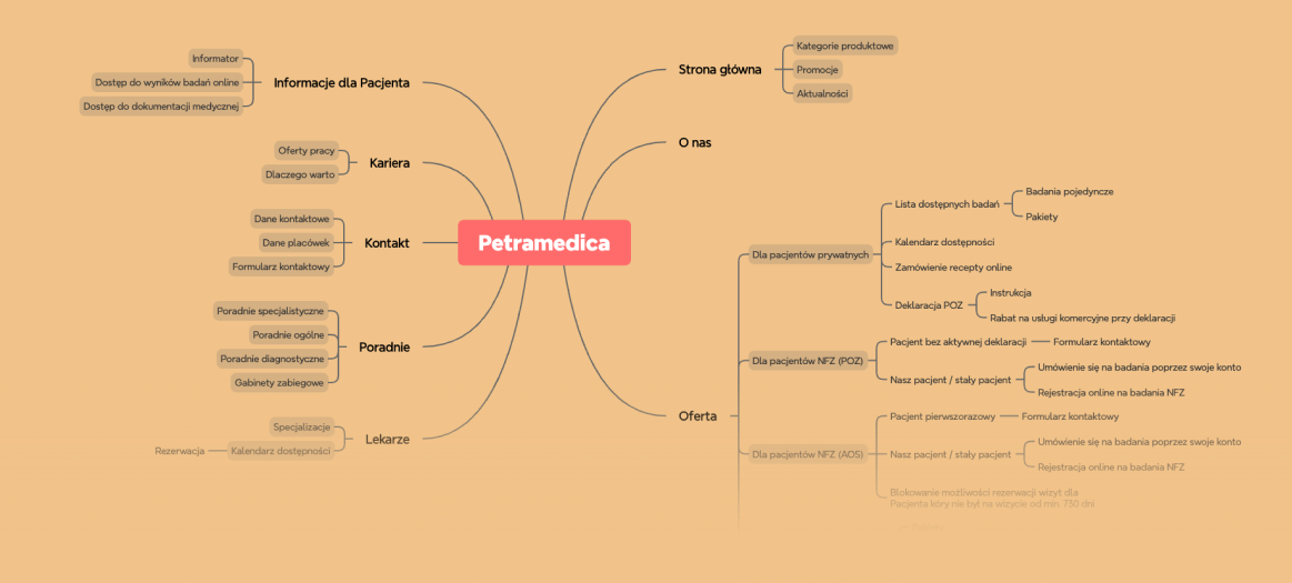
The core of this project was wrestling a massive, tangled medical database into an intuitive ecosystem. Before committing to the final architecture, I went through an intensive ideation phase, sketching out multiple lo-fi navigation models to test how to best categorize the massive volume of services.
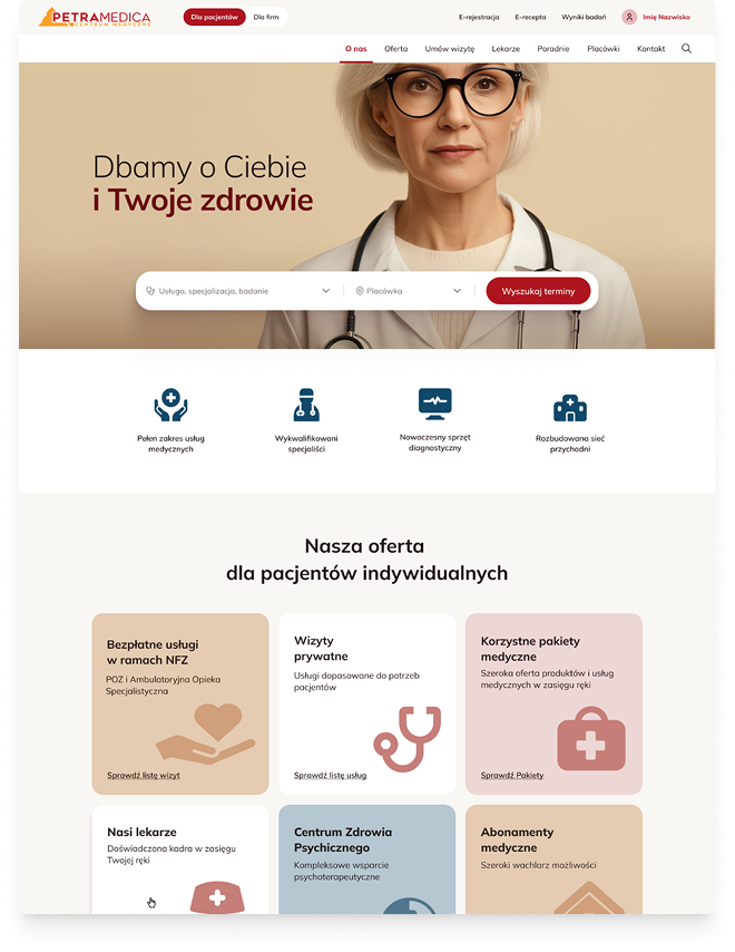
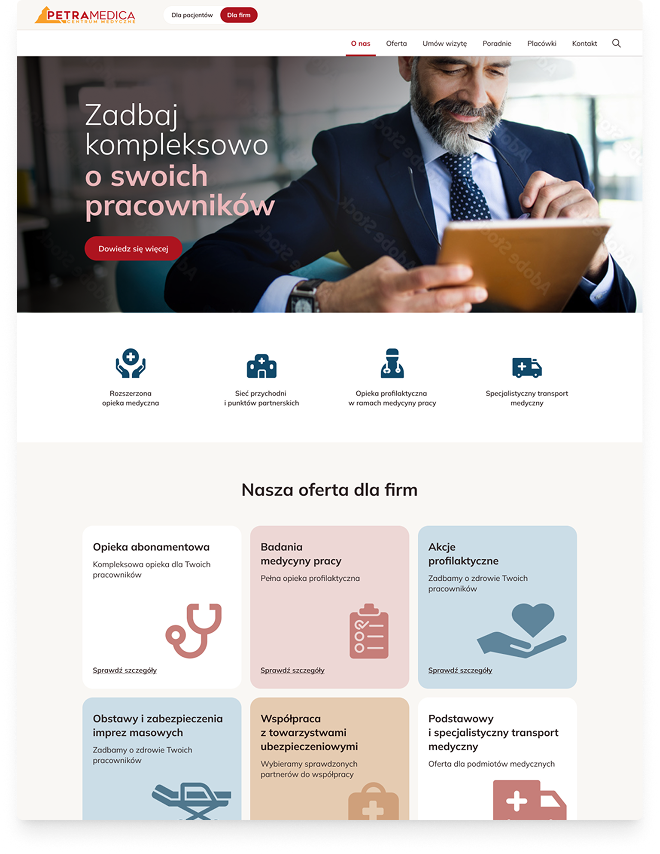
After exploring various Information Architecture models, I completely decoupled individual patients (B2C) from corporate clients (B2B), giving them dedicated spaces and distinct user journeys.
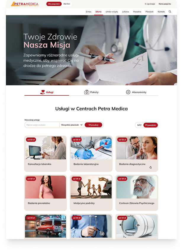
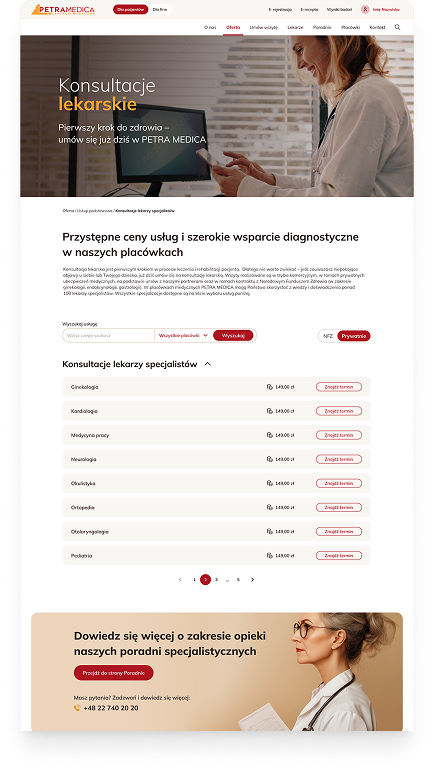
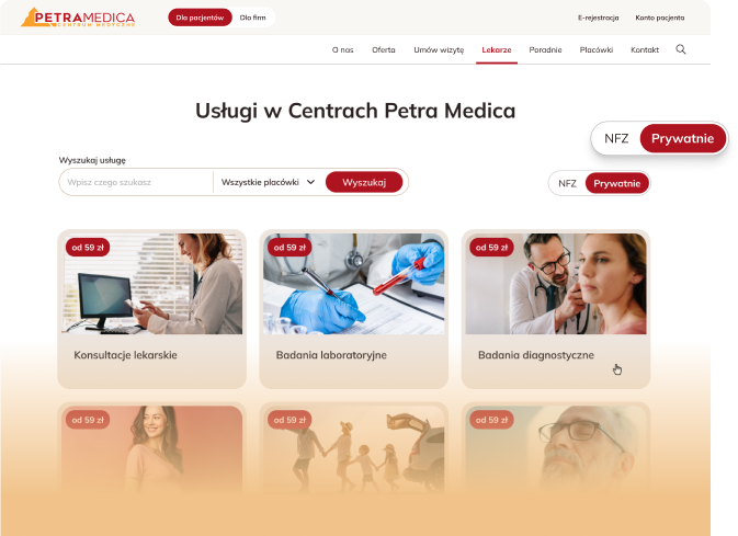
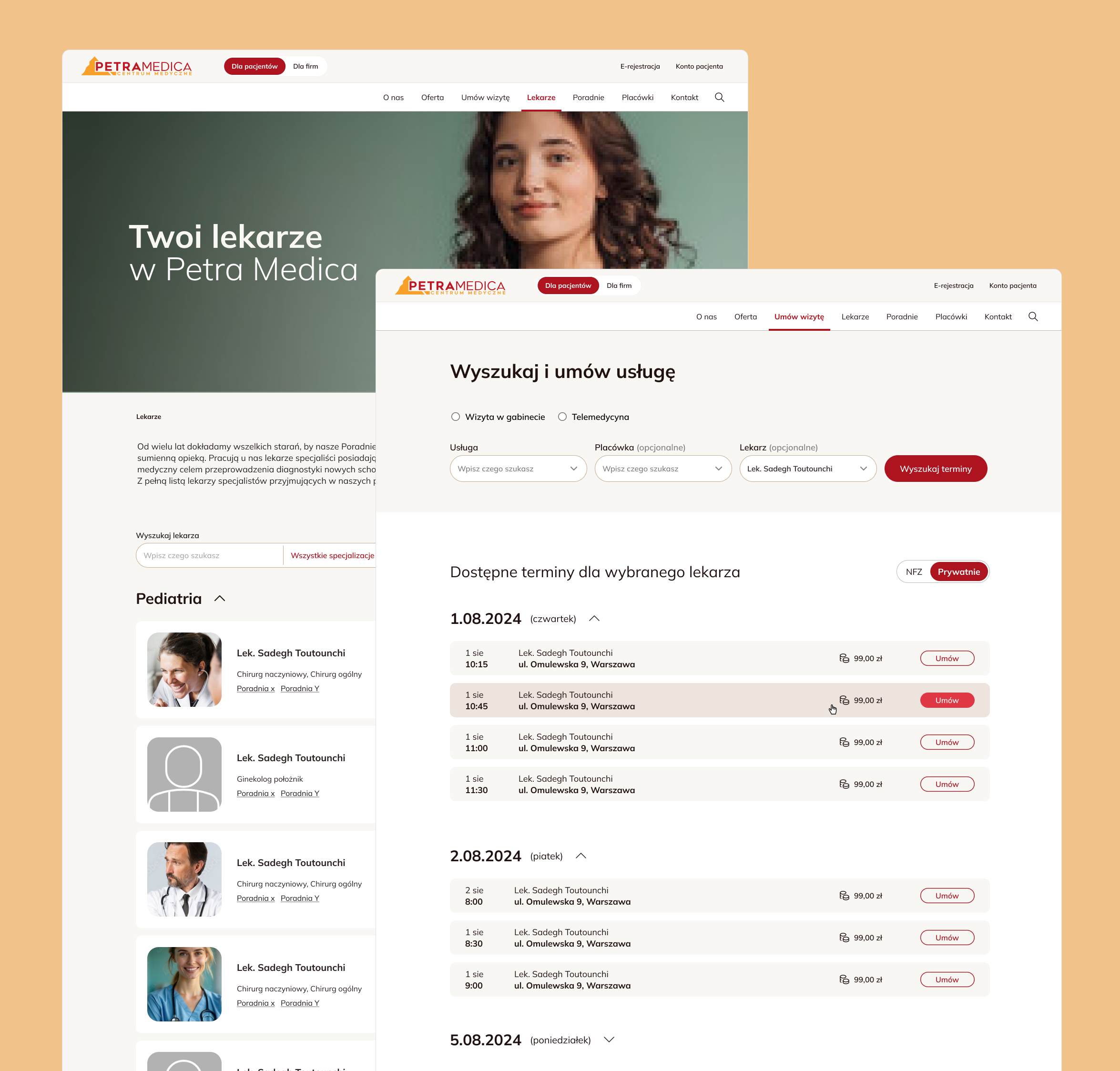
To solve the Public vs. Private care dilemma, I split the catalog and introduced a seamless, highly visible Tab system. This allowed users to toggle instantly between public and commercial contexts without losing their place.
I designed a new catalog structure that allowed users to filter naturally by service type, clinic location, and specific doctor availability.
Using UX as Leverage Against Legacy Systems
The Constraints
The API we needed to use in order to integrate with NFZ database was severely limited; it couldn't aggregate services or link specific doctors to treatments. This forced us to scrap and redesign our service catalog flows twice.
Using UX as Leverage
The new UX architecture I designed was so evidently beneficial that it armed our client with powerful arguments. Instead of building a costly custom integration, the client used our UX vision to successfully pressure their external Health Information Service vendor into upgrading their software to support our functionalities.
Handling Scope Creep
Late in the project, the client was so thrilled with the framework that they suddenly added 30 new subpages. I quickly adapted by introducing a new tier to our Information Architecture, ensuring the sudden expansion didn't break the navigation's logic.
Delivering a Functional Digital Clinic
Handoff
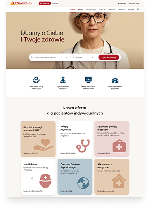
With a solid UX foundation approved, I collaborated closely with the UI Designer to translate this into a modular system featuring location-based filtering and one-click booking structures, communicating clinical trust.
The Business Impact
The platform launched successfully in early 2026. We transformed a frustrating static site into a functional digital clinic, and the system is now technically prepared for Phase 2 (a full Patient Portal with medical history).
This project was a masterclass in dealing with legacy systems and external vendor limitations. I learned that a tangible UX vision doesn't just improve interfaces—it can actively drive business negotiations and force technological upgrades from third-party providers.
Transitioned from "fake" email forms to a fully automated, self-service patient booking platform.
Scaled the Information Architecture instantly without breaking logic when the client unexpectedly expanded the scope.
Successfully decoupled B2B (corporate) and B2C (individual) patient journeys, introducing a seamless Public/Private toggle.
Leveraged the UX vision to successfully pressure a rigid external vendor into upgrading their legacy Healthcare Information System software (HIS).