

Building a self-service platform that offloads the Customer Success team — and lets advertisers actually succeed on their own.
The project involved a comprehensive concept design and redesign of the AdTonos platform — an innovative solution in the digital audio advertising space. The goal was to create a self-service system that would offload the Customer Success department, allowing them to focus on strategic consulting rather than technical support for struggling advertisers.
AdTonos is a programmatic audio ad platform: advertisers create campaigns, set targeting criteria, define budgets, and the platform runs real-time bidding for audio inventory (podcasts, streaming). The complexity of this ecosystem was being exposed raw to users who had no idea what "CPM" or "Playout" meant.
Concept fully defended before the executive board — concluded as a complete success.
Replaced an intimidating 6-step control panel with an intuitive, intention-based campaign wizard.
Delivered a comprehensive, modular design system — a bulletproof tool for independent software development.
Built for programmatic experts. Completely inaccessible to everyone else.
Cognitive Overload
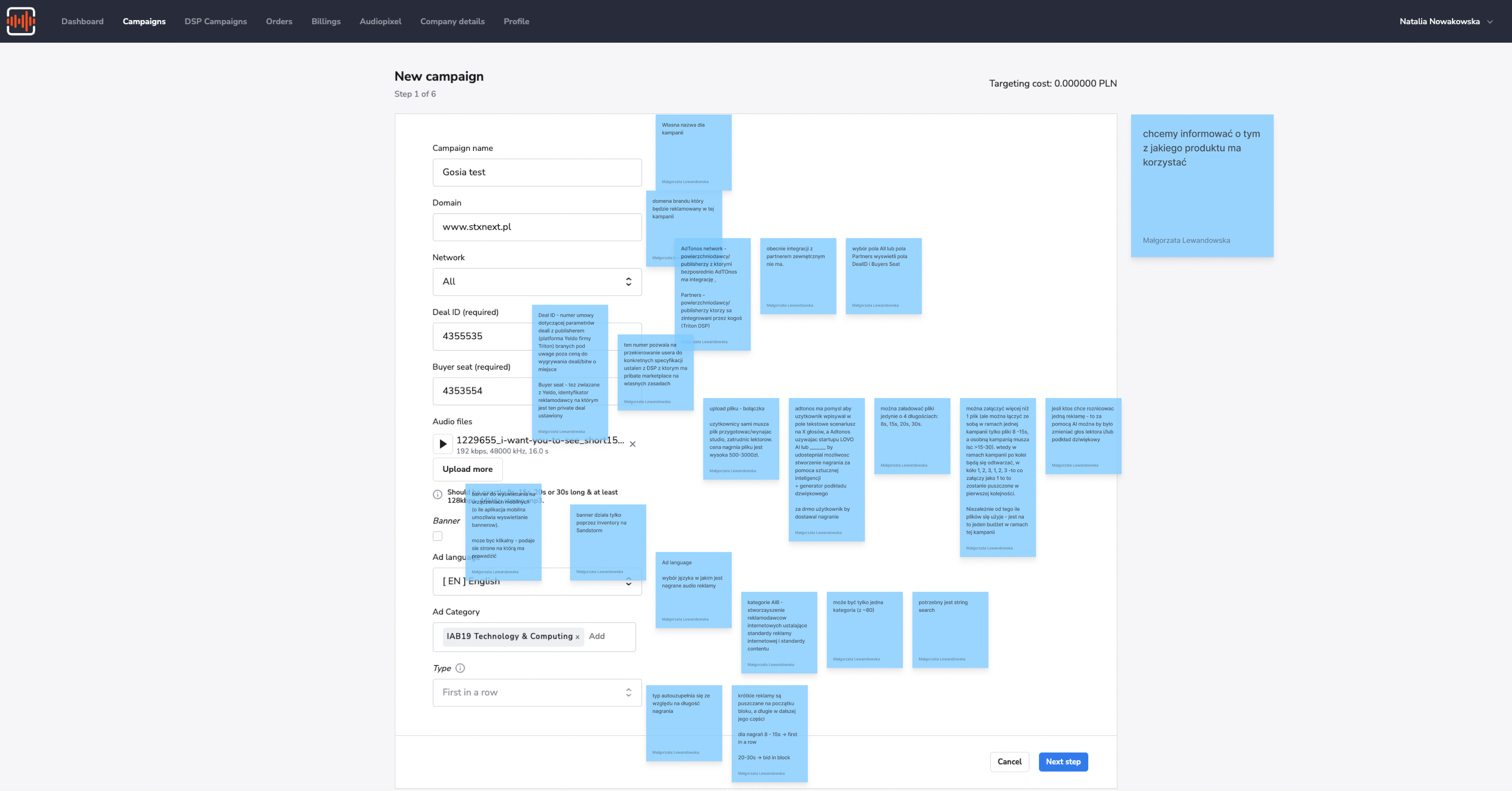
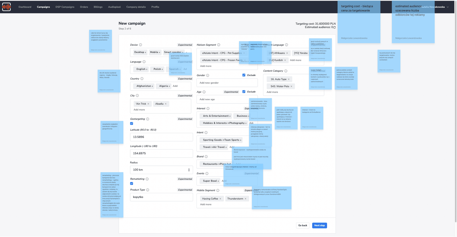
The old interface resembled an airplane control panel — it forced users through a tedious 6-step process full of technical fields without a clear hierarchy or logical sectioning.
The Jargon Barrier
Terms like Pre-roll, Inventory, Playout, and CPM were insurmountable obstacles for non-marketing professionals. The language excluded the very users the platform needed to acquire.
Flying Blind
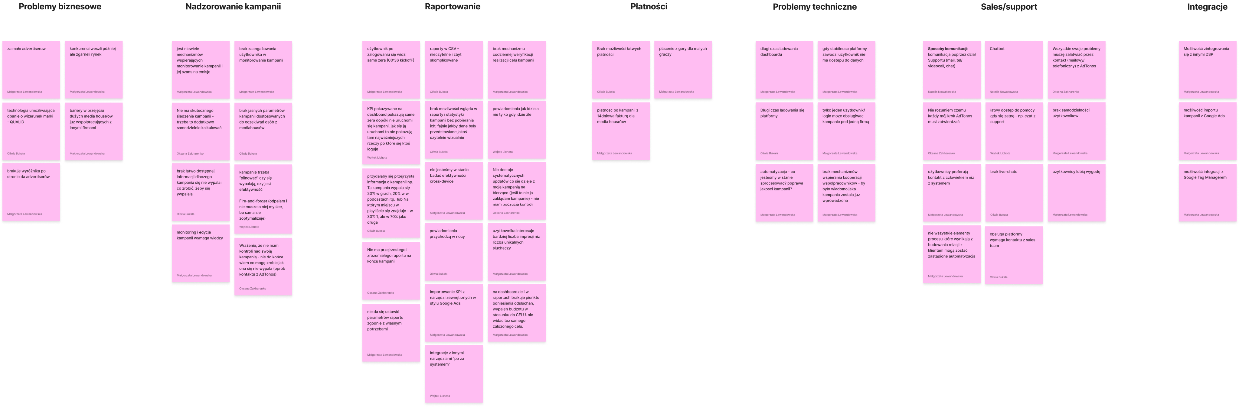
Advertisers felt they had zero control over their budgets. They reported frustration over a "lack of a mechanism for daily verification of campaign goals" and a complete absence of intuitive post-launch instructions.
One platform, two completely different users — and one "Chameleon" design strategy.
I led a detailed UX audit combined with in-depth interviews (IDIs) with users and key company stakeholders — CEO, VP of Sales, Customer Success. We gathered diverse perspectives to balance business goals with user reality.
Instead of creating two separate tools, we decided the interface must fluidly adapt to the user's knowledge level. We adopted a principle: "Creating and managing ads is not quantum physics."
- Manages large budgets for multiple clients
- Values automation to maintain work-life balance
- Needs to hand off campaigns to junior colleagues
- Facebook Ads imports, Audiopixel conversion tracking
- Detailed reporting — auction position, brand safety
- Template libraries for fast, repeatable setup
- Inherited his father's garage
- Wants local clients but knows nothing about advertising
- Overwhelmed by any technical jargon
- "Fire-and-forget" mode — automatic budget optimization
- Plain language throughout, zero marketing terminology
- A process as simple as posting on social media
Customer Journey
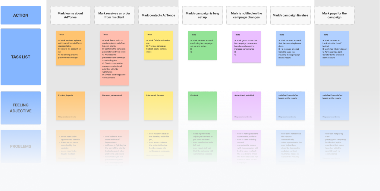
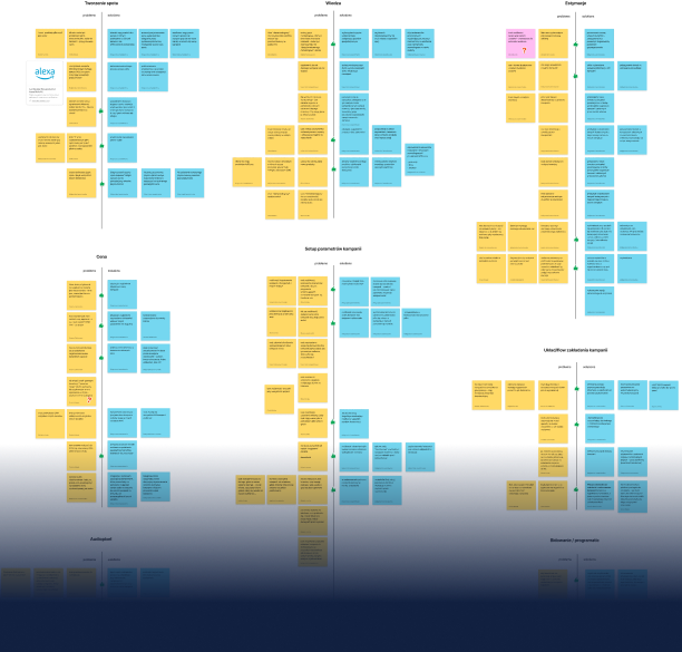
To bridge the gap between the two opposite user flows, we mapped out their detailed customer journeys. We identified each friction point, decision threshold, and emotional drop-off in the previous interface. This allowed us to build an information architecture that caters smoothly to both agency power-users and local small-business novices.
Hiding the complexity of programmatic logic behind simple human choices.
The key to taming this beast was hiding the complex programmatic logic behind simple user choices. During the ideation phase, I rapidly sketched lo-fi wireframes to test different flow configurations, aiming to drastically reduce cognitive load.
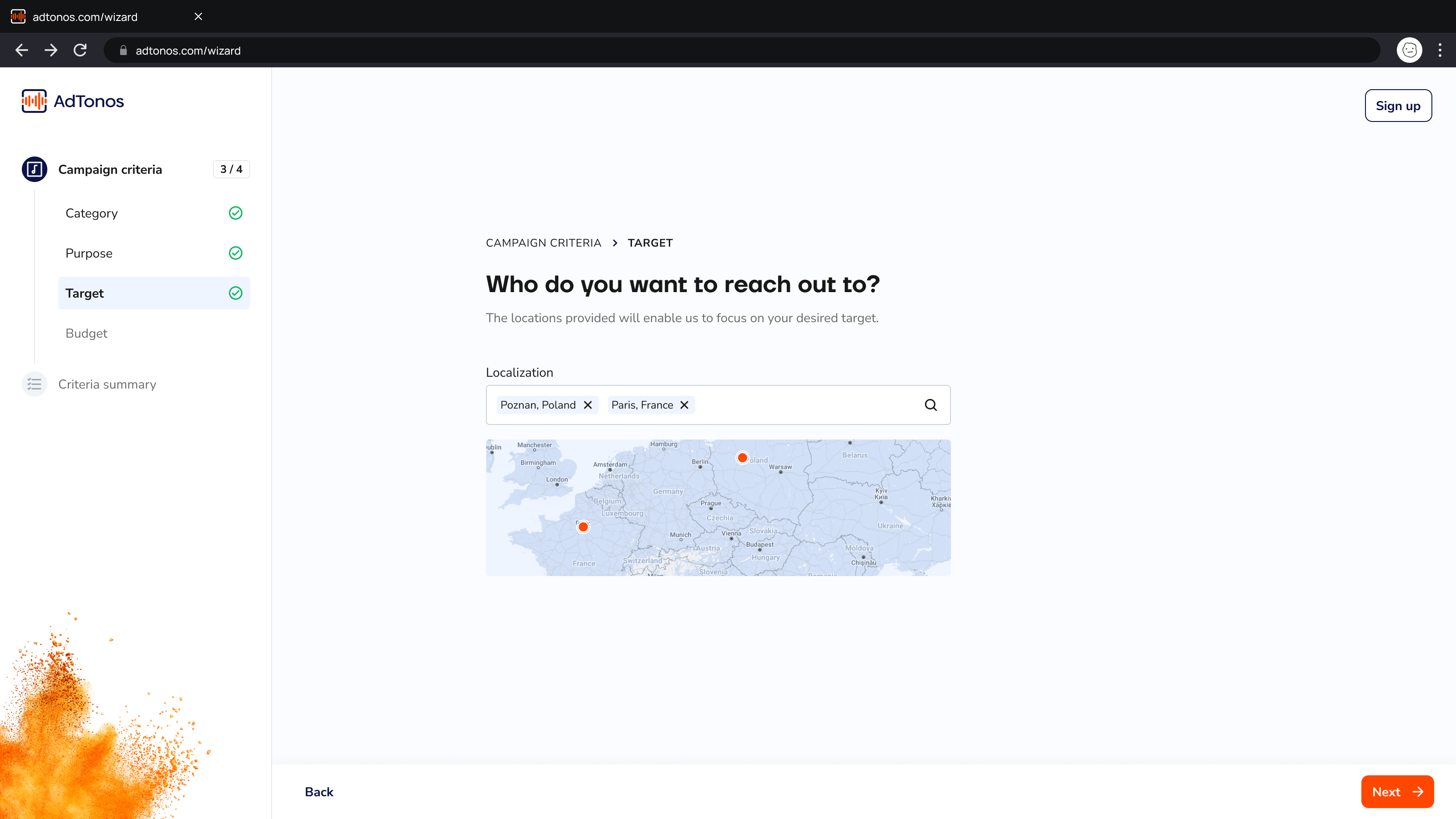
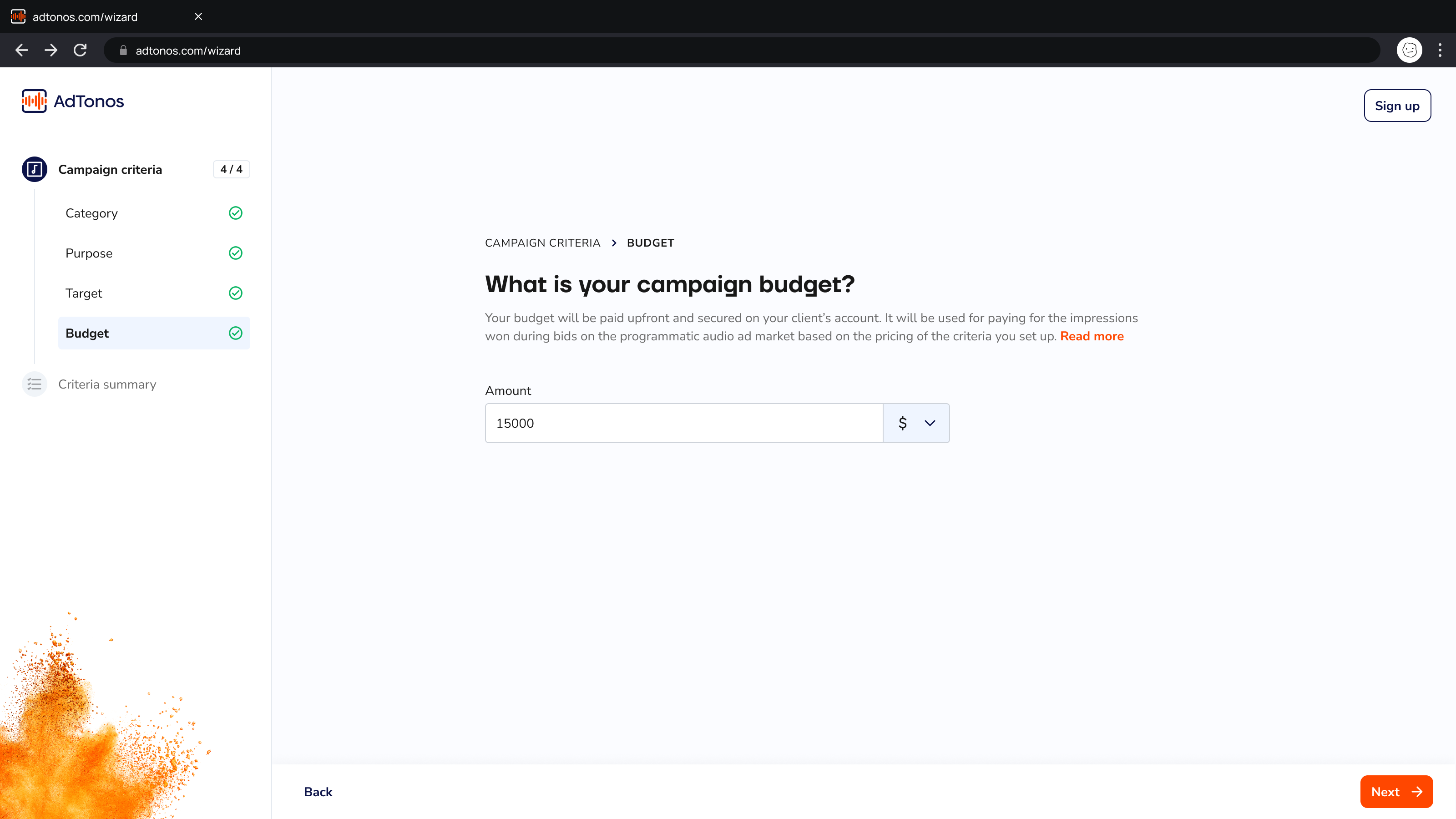
We replaced the daunting 50-field technical form with a clear, step-by-step wizard ("What is your ad's category?", "Who do you want to reach?"). For Derek, the system suggested predefined bundles. For Mark, "Advanced Settings" toggles opened the full programmatic configuration.
Since algorithms are incomprehensible to novices, I designed an intention-based system. The user defines criteria as "must-have" or "nice-to-have" and sets a maximum bid — the algorithm takes care of the rest.
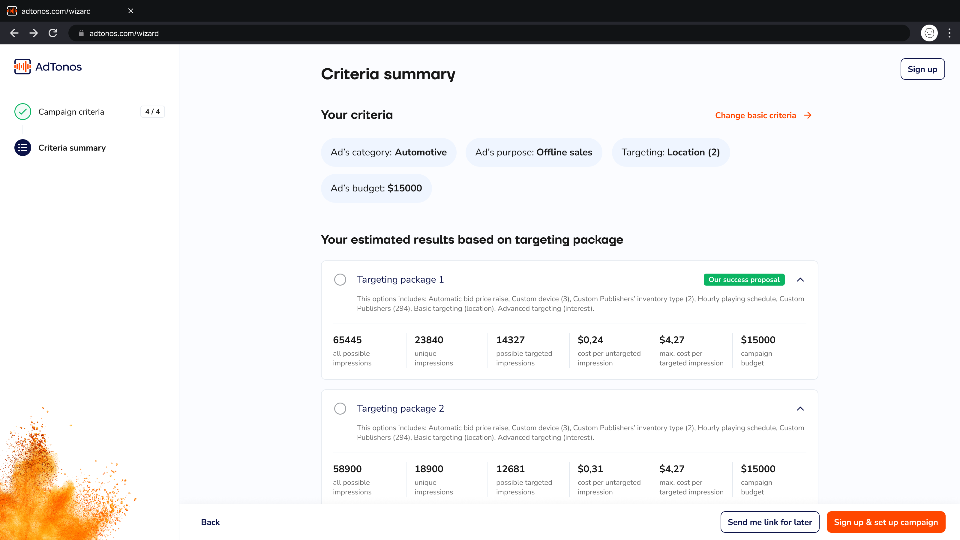
We solved confusing pricing by introducing live simulations — estimated reach and cost updating in real-time with every parameter tweak — and transparent charts in the reporting section.
Plain-language prompt, interactive map, tag-based city selection. The wizard step in action — no jargon, no cognitive load.
The most dramatic moment happened right at the end — the ultimate test of our agility.
The Plot Twist
Our UX concept was validated and everyone was thrilled. However, during the final presentation to the CEO — the HiPPO (Highest Paid Person's Opinion) — dropped a bombshell: a completely new, radical business vision. He wanted to entirely reverse the architecture, putting ad creation on the public website as a lead magnet and placing configuration and payment behind a registration paywall.
The 2-Week Rescue Sprint
We had exactly two weeks to rebuild the logic before the final handoff deadline. I threw out my initial safe concepts and dove into radical re-ideation. Week one: shifting the UX concept, rewriting flows, and sketching new architecture for the public/private split. Week two: the UI Designer translated this into final high-fidelity screens.
We survived this crisis solely because, from day one, we designed the platform in a modular way — "like puzzle pieces." We could quickly rearrange entire sections without starting from scratch.
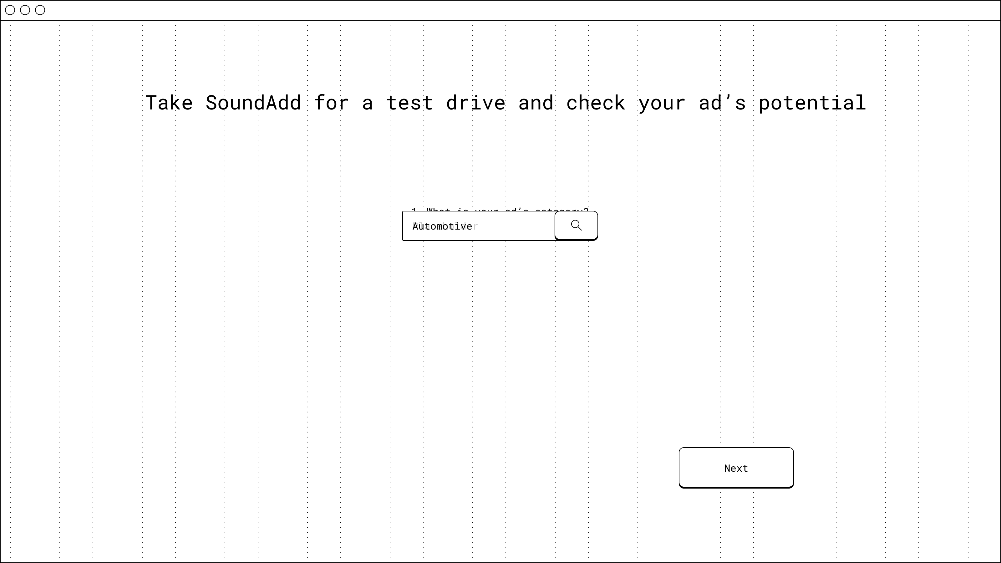
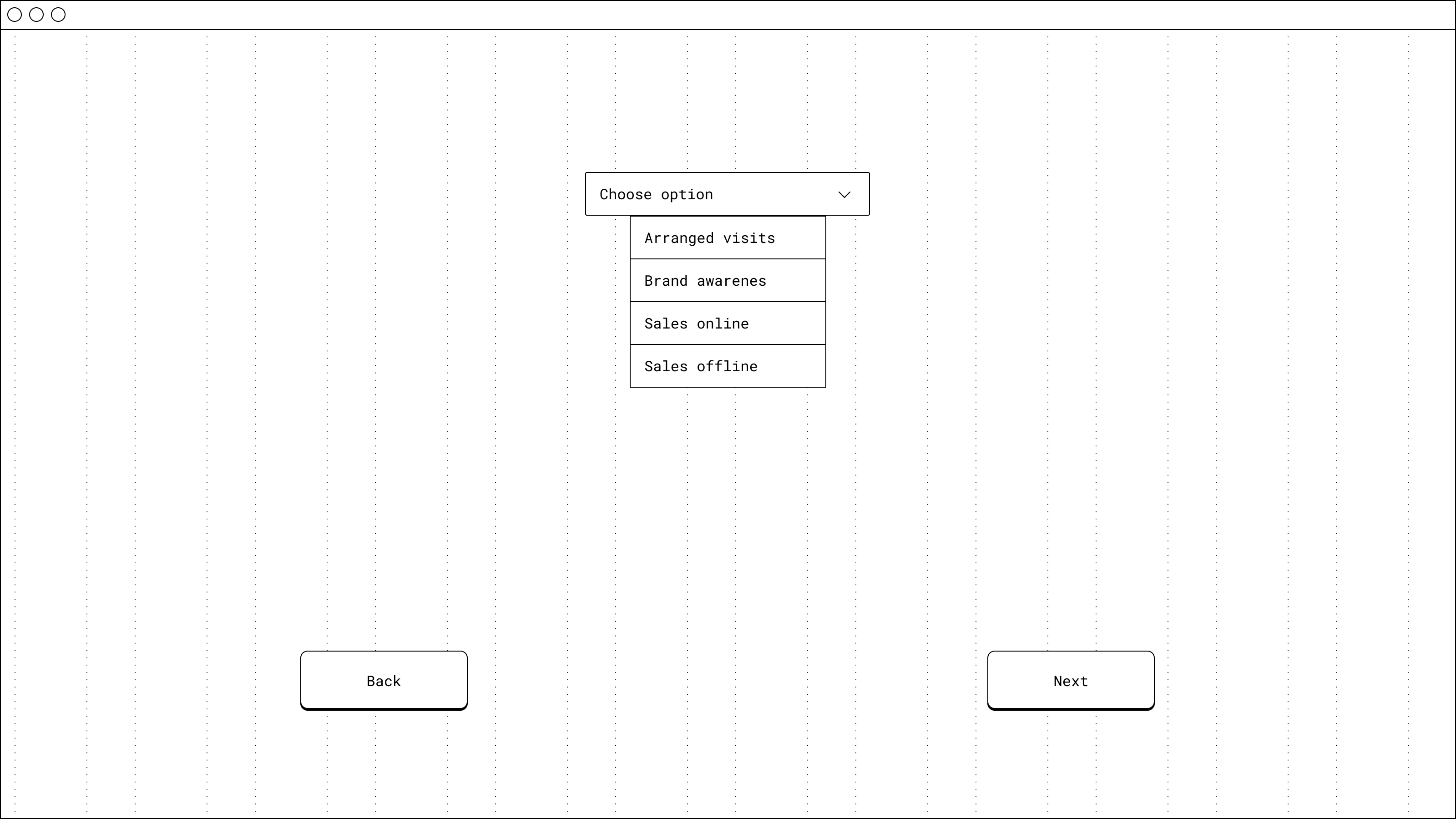
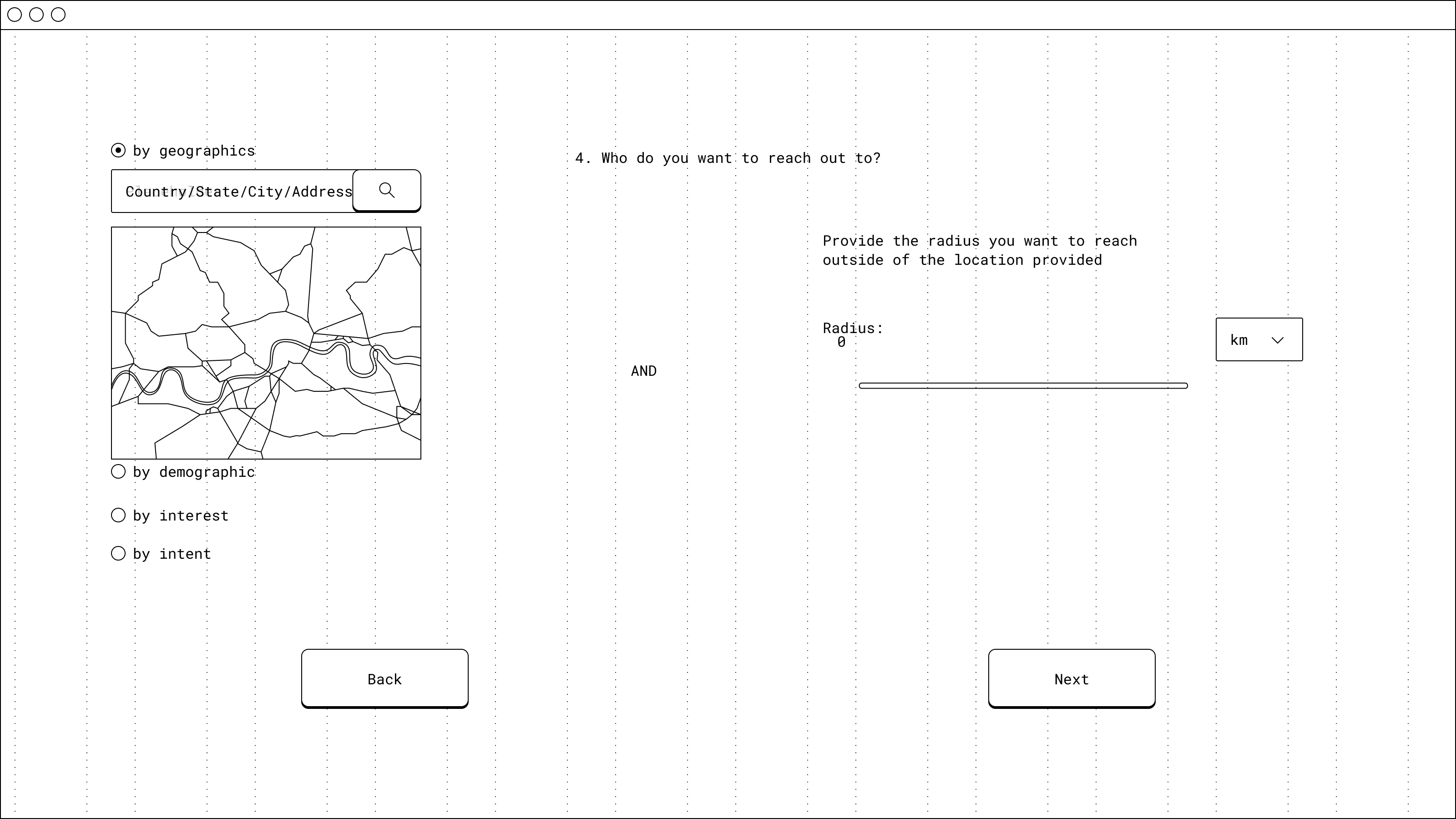
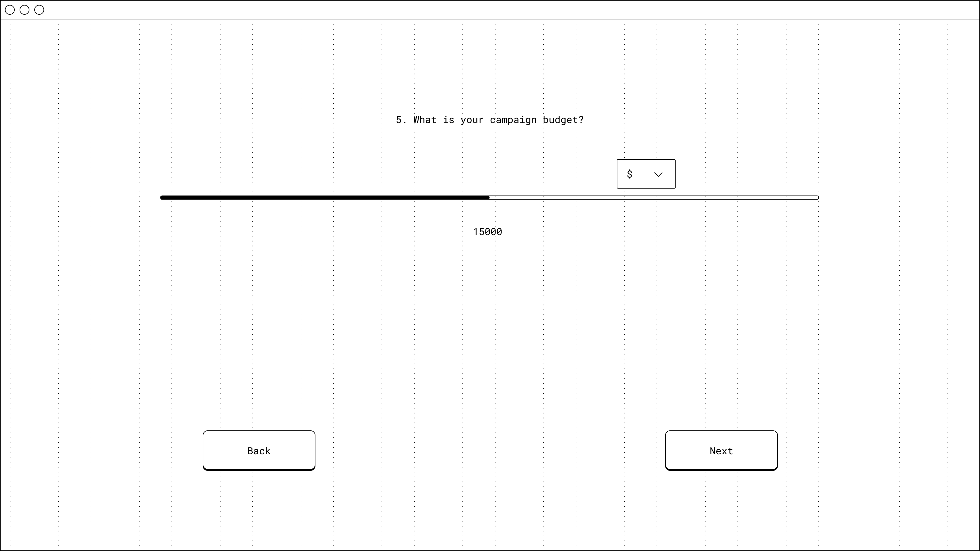
A complete, bulletproof architecture — and a masterclass in design agility.
Business Outcome
Due to unforeseen financial restructuring on the client's side at the end of 2022, the development implementation phase was temporarily paused. Despite this, the modular architecture we delivered gave the client a ready, bulletproof tool for independent software development — safeguarding the platform's look & feel and logic for the future.
My Biggest Lesson
This project was a true trial by fire in design flexibility. My role isn't just to defend research results — it's to instantly translate a sudden business strategy pivot into a logical information architecture. Modular design and systems thinking from day one is the only true insurance policy against a sudden crisis in an agency project.
Transitioned from "fake" email forms to a fully automated, self-service patient booking platform.
Scaled the Information Architecture instantly without breaking logic when the client unexpectedly expanded the scope.
Successfully decoupled B2B (corporate) and B2C (individual) patient journeys , introducing a seamless Public/Private toggle.
Leveraged the UX vision to successfully pressure a rigid external vendor into upgrading their legacy Healthcare Information System software (HIS)