

The Context: Scaling a Premium Consultancy
ZIEL.swiss is a specialized Swiss consultancy dedicated to guiding enterprises through complex digital transformations. The founder’s profound industry expertise was highly sought after by C-level executives. However, the business faced a classic growth bottleneck: relying predominantly on traditional, 1:1 premium consulting sessions naturally limited the company’s ability to scale globally.
The core objective of this project was to break through this ceiling by transitioning into a scalable, digital-first approach. Our goal was to design a comprehensive B2B web platform that would digitize the founder’s proprietary business assessment framework—known as the “Digital Pulse Check”. Rather than replacing the human element, this new digital ecosystem was designed to serve as an intelligent, highly engaging lead magnet. By establishing a dedicated community space and offering business owners a digital taste of ZIEL’s expertise, the platform would naturally funnel qualified leads into their premium consulting pipeline, unlocking global scalability.
Successfully translated dense B2B theory into a clear, structured digital ecosystem.
Achieved absolute technical feasibility—the dev team reported zero implementation blockers once the designs were handed off.
Built a robust digital community space ready to serve as a premium B2B lead magnet.
Designing in the Dark
We kicked off with an ambitious vision, but immediately ran into constraints that required serious agility.
No Direct User Access
We had zero opportunity to conduct direct preliminary testing with our target audience (busy C-level executives and business owners). I had to find a workaround.
Translating Dense Expertise
The source materials provided by the founder were incredibly rich, detailed, and deeply academic in nature. Dumping this directly into a digital format posed a massive cognitive load risk for time-poor executives.
Sophisticated Logic
The client had developed a highly nuanced, proprietary evaluation scale that needed to feel effortless as a digital interaction.
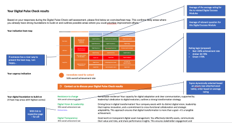
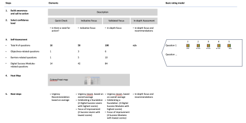
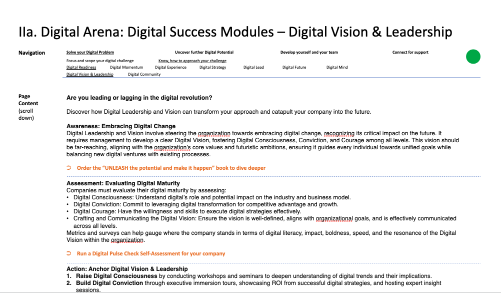
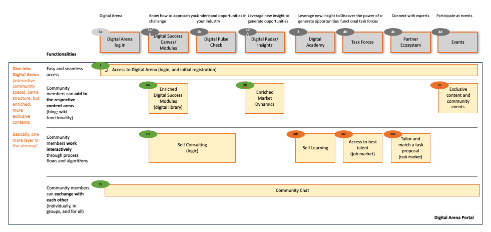
"If someone has a better and nicer way to present this, I am happy..."
Raw documentation and complex logic exposed: visualizing the founder's expansive vision before transformation into structured design.
Discovery & Competitive Benchmarking
Faced with the lack of direct access to end-users, I realized my primary role wasn't just to design screens—it was to act as a rigorous translator between complex theoretical frameworks and a user-centric reality.
SME Interviews & Benchmarking
I conducted deep-dive Subject Matter Expert (SME) interviews with the founder to extract the core of his methodology. To complement this, I conducted extensive competitive benchmarking of best-in-class B2B platforms. I needed to analyze how market leaders handled massive data inputs and complex forms without causing user drop-off.
Evangelisation with Results
Based on my research, I successfully advocated pivoting away from a static, text-heavy website. Instead, we architected an interactive, step-by-step journey ensuring users could engage meaningfully with the material without feeling overwhelmed.
Taming the Chaos
Analysis & Chunking
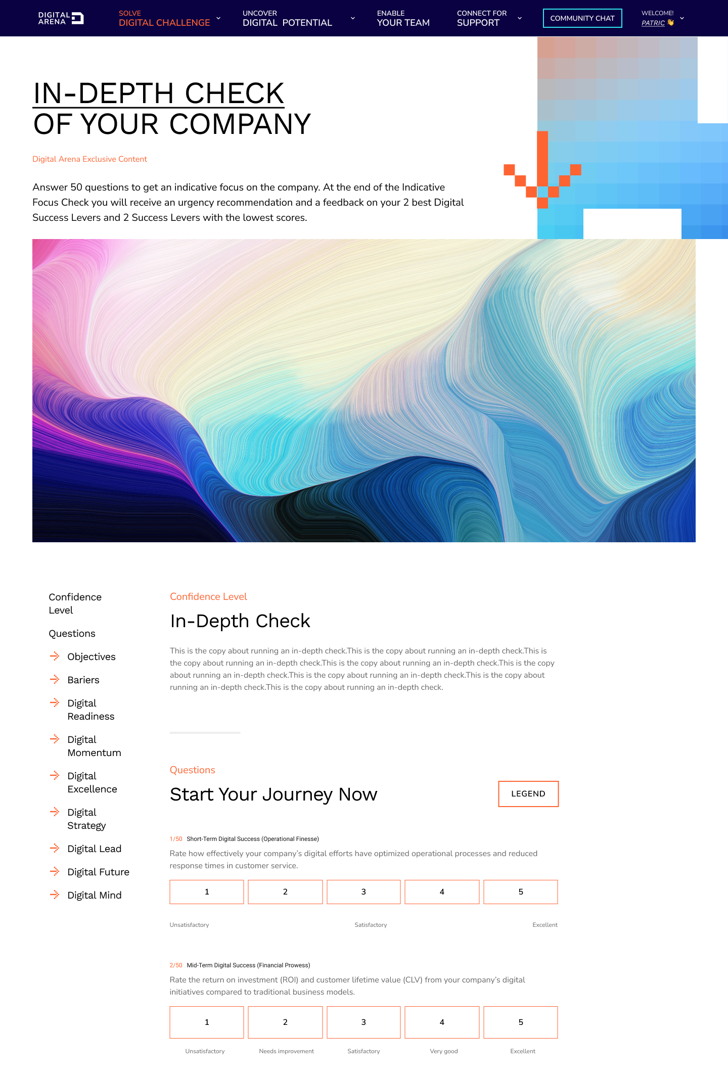
I independently wrestled with the extensive source materials, creating concise summaries. I redesigned the "Digital Pulse Check" screening test by breaking down a comprehensive list of questions into digestible, logical steps (chunking).
Mapping the Ecosystem
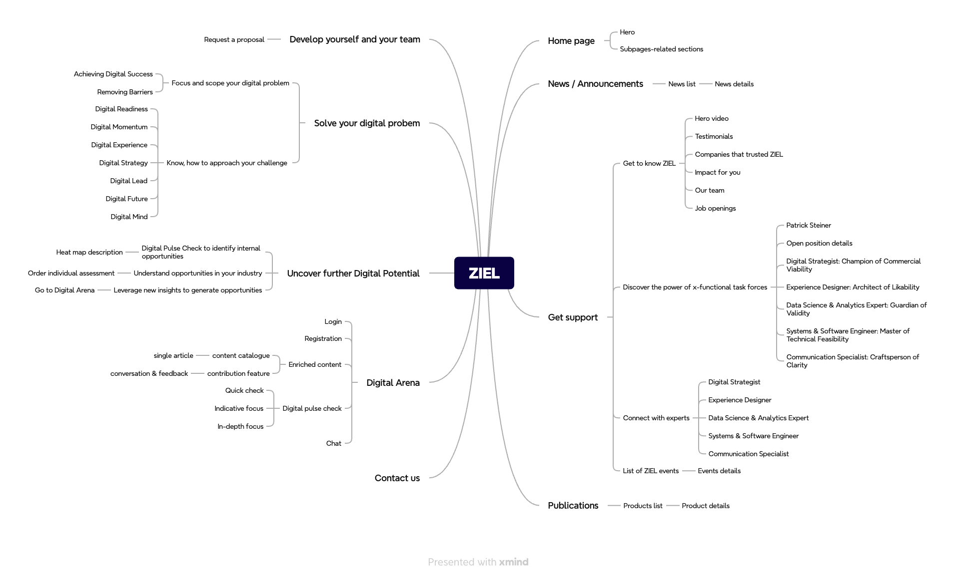
To truly grasp the founder's expansive vision, I mapped out all described pages, interconnections, and user flows into a massive, interconnected sitemap. This "dirty work" was the breakthrough moment—it allowed both the team and the client to finally see the true scale of the product ecosystem.
Streamlining Interactions
I simplified the interaction model for the proprietary grading scale, ensuring the digital input mechanism felt effortless and reduced friction.
Bridging Design & Tech
Guerrilla Testing
To compensate for the lack of external test users, I validated the new information flow and form logic by testing it internally (guerrilla testing) with our development team. This scrappy approach paid off immensely.
Early Tech Validation
By actively consulting with developers during the conceptual phase, we ensured absolute technical feasibility. The result? Zero handoff blockers.
Smooth Transitions
Midway through the project, we experienced a transition in the UI design team. Thanks to my structured collaborative process and clear IA, I smoothly onboarded the new UI Designer without losing a single day of project momentum.
My Perspective
This project reinforced my belief that a UX Designer's most crucial role in B2B is fiercely protecting the user from information overload while honoring the depth of the business's expertise. If I were to tackle a similarly text-heavy project today, I would leverage AI (LLMs) tools to help categorize and process the massive volumes of content more efficiently, allowing for faster iteration of copywriting concepts as the platform scales.
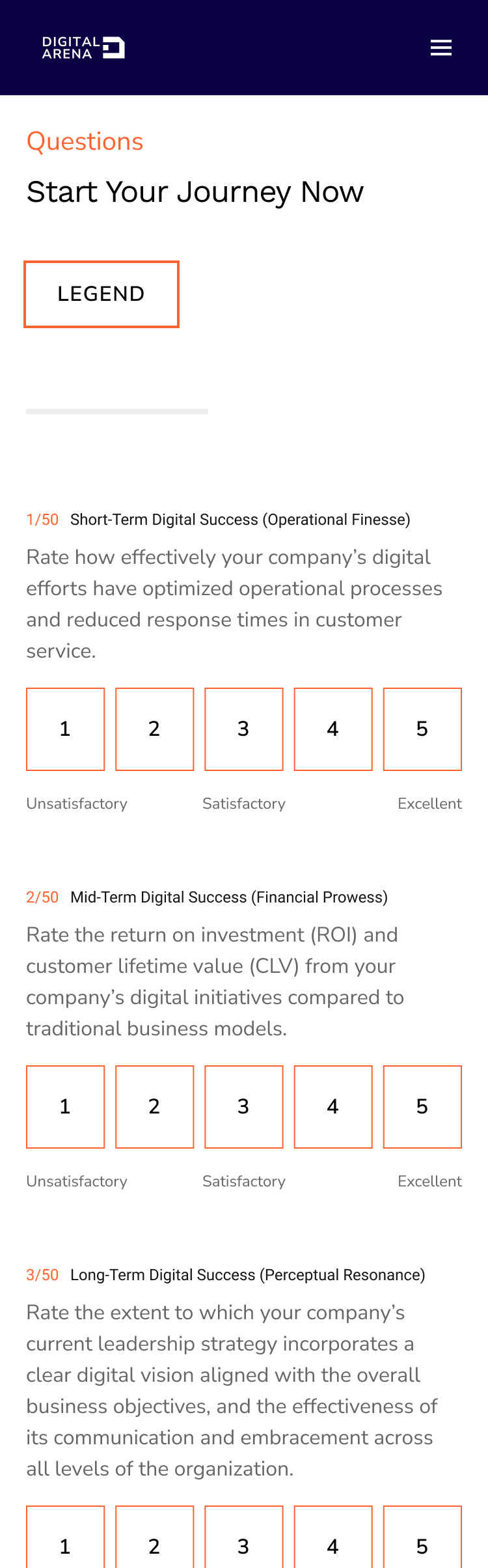
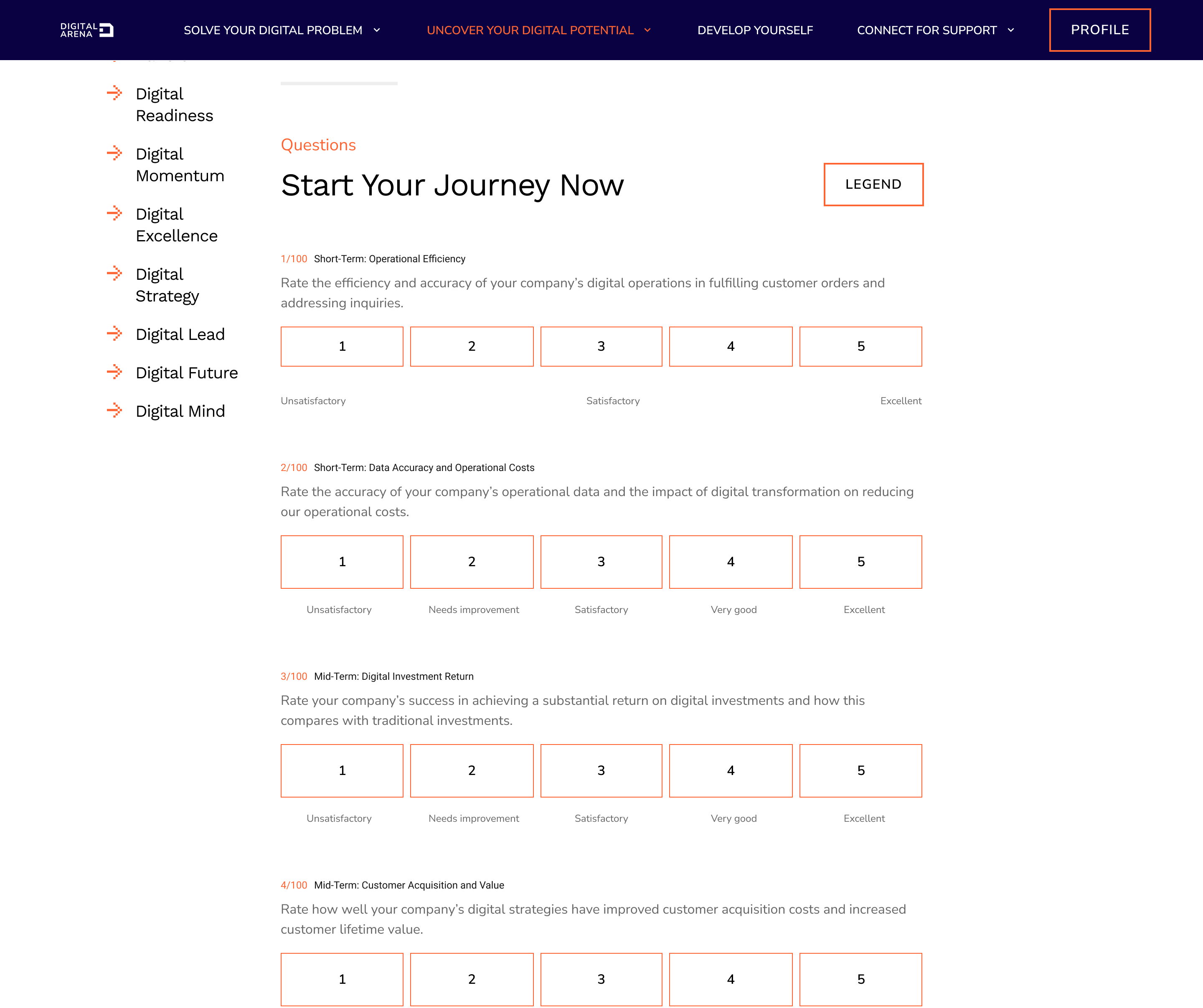
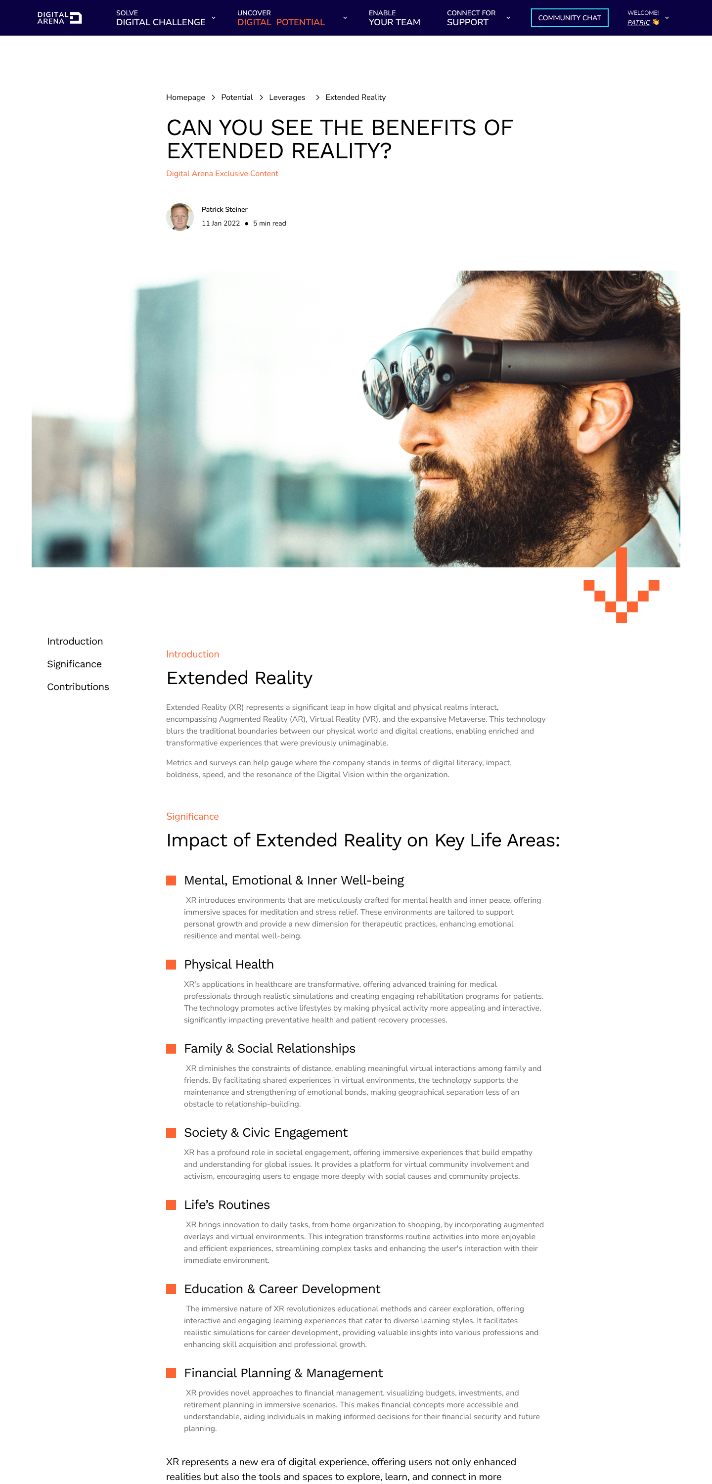

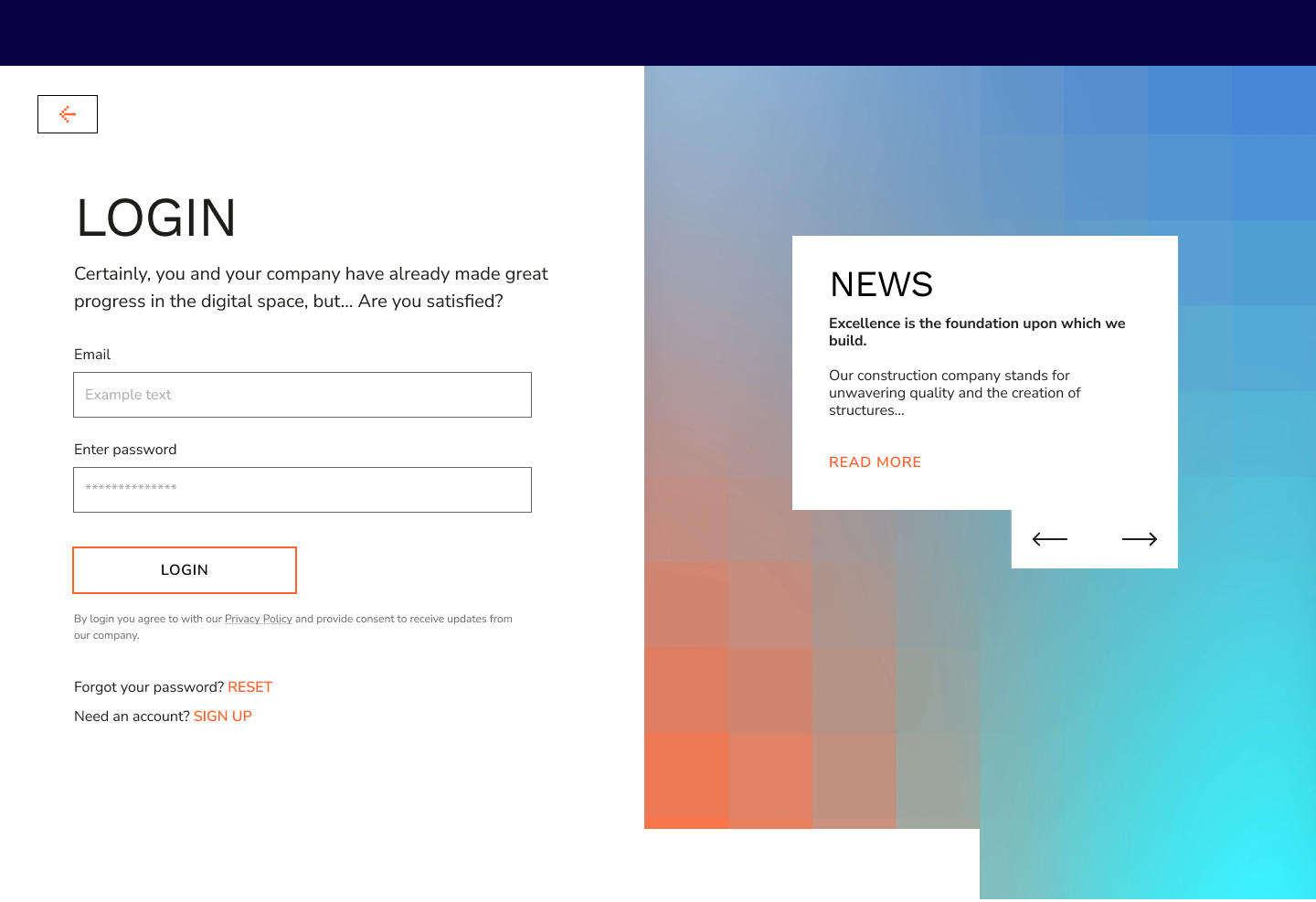
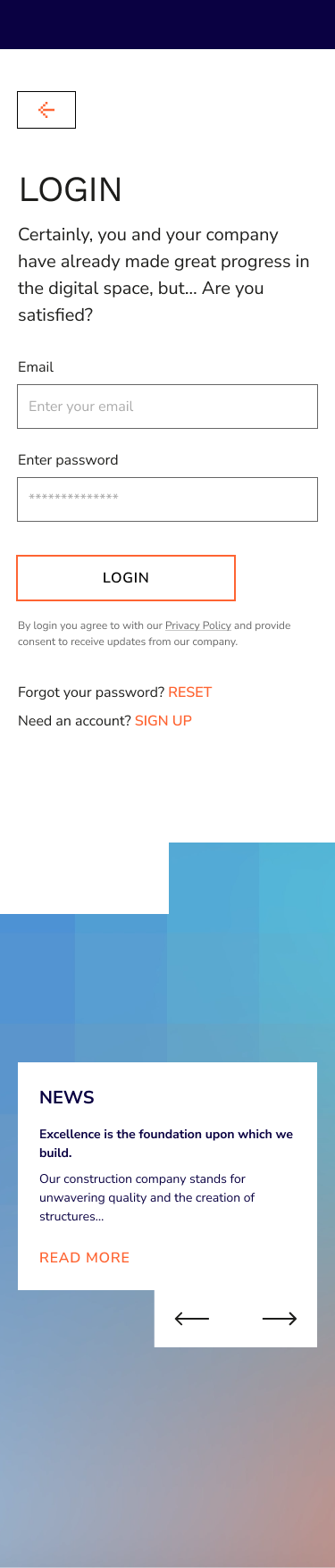
The Final Product
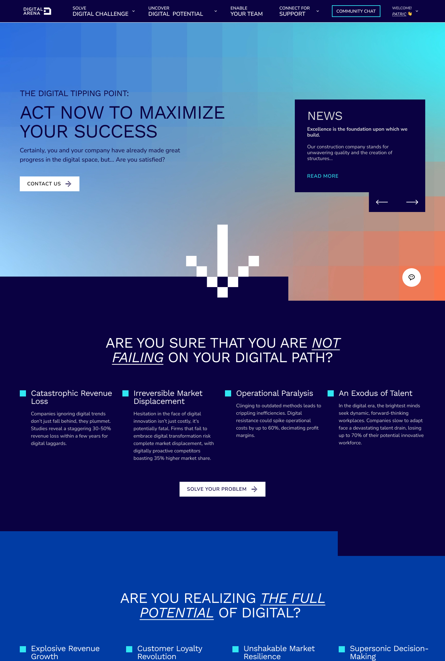
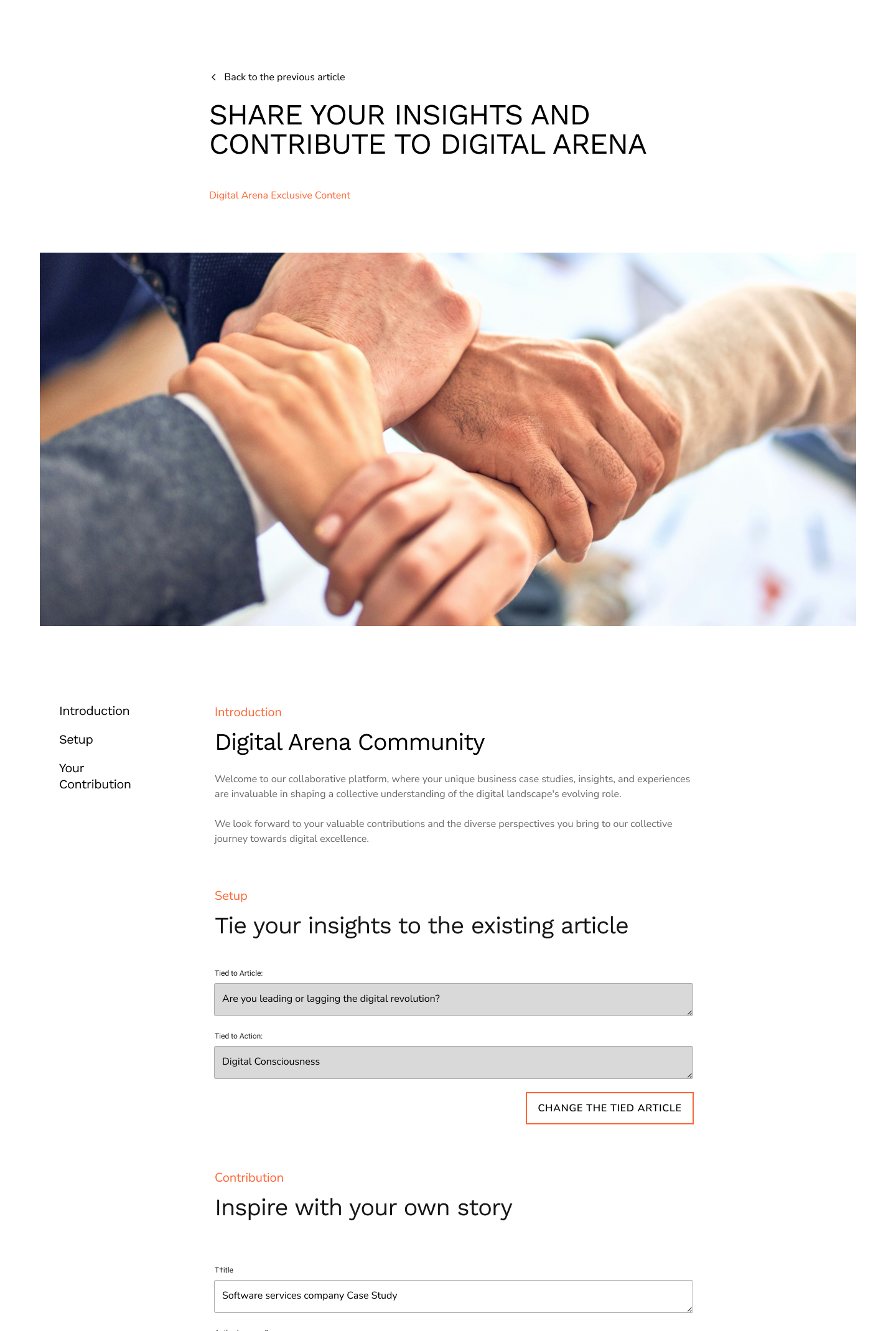
From complex frameworks to an intuitive, scalable digital ecosystem
Production screens - ZIEL and Digital Arena - 2024